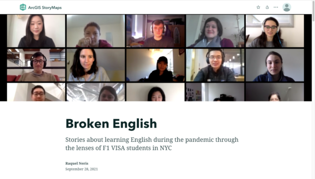
Broken English is a web-based platform that presents an ethnographic research about the lives of ESL (English as a Second Language) students and teachers in English Schools in New York City, emphasizing the challenges they faced during the Coronavirus pandemic in 2020. This research will be presented to users through a narrative that is developed in two parts:
Part 1: ESL school challenges during the Pandemic
Users will start understanding English as a Second Language (ESL) programs and the challenges that their communities (students, teachers and staff) faced during the Pandemic. Texts, images, maps, and short stories in the form of videos will be presented in order to provide users a deep understanding of the problem through different lenses.
Part 2: ESL reimagined
Based on the participants’ suggestions of the ethnographic research, users will have access to a toolkit with different methods and activities that can be developed in online, in-person, and hybrid ESL classes.
___
How do I plan to do it?
I intend to develop this platform in two phases:
Phase 1: Pilot research, prototype, and testing
Estimated time: 2 months
I will start this work by doing a pilot research interviewing between 8 to 12 people, including students and teachers of two ESL schools based in NYC: New York Language Center and ZONI, which are both institutions that I have easy access to.
After that, I will create a prototype and present it to the participants to collect feedback. I should also do the work by myself to avoid unnecessary expenses.
The prototype should use two web applications: Story Maps, which is a free platform to present interactive and multimodal stories through the use of maps, videos, and other sorts of media; and Kumu, also a free application that helps you create system visualizations.
Phase 2: Complete research and platform evolution
Estimated time: 4 months
Based on the learnings of Phase 1, Phase 2 is the process of evolving the platform, including more research with communities of more English Schools in NYC. Updates of the application and constant testing should be developed throughout the process. This phase should also involve the work of a dedicated team composed of myself and three other specialists in the fields of Digital Humanities, Design, and Education. I may use the same web applications used on the Phase 1.
___
Why did I choose this idea?
I have three reasons why I want to develop this project:
1 – As I was an international English student in an ESL School in NYC, I can use my personal experience and network to access participants to my research;
2 – It gives me the possibility of analyzing the problems and opportunities of the phenomena through the lenses of Educommunication, a field of studies and practices that I studied during my first Master’s in Communication and Education at the University of São Paulo. For those unfamiliar with this term, Educommunication is a field of study and practices related to planning, implementing, and evaluating processes, programs, and products that create and strengthen communicative ecosystems in educational contexts. It was founded by the Latin American theoretical currents of liberating pedagogy, popular communication, and cultural studies.
3 – I want to help ESL communities rethink their practices by providing visibility for the challenges they faced during the Pandemic and accessible resources for successful educational experiences.
The introduction of the Digital Memory Project Reviews, which is a compilation of several reviews of digital memory projects developed by the students of the course Digital Memories: Theory and Practice, presents an interesting reference used for analyzing Digital Humanities projects: the “How Did They Make That?” video. In this post, I want to make a brief presentation of Posner’s reverse-engineering of digital products and suggest how it could be improved to leverage the impact of digital humanities projects.
In the video, Posner presents a method that helps to unveil how digital humanities projects are built (what she also calls “black boxes”). She then defines three patterns that are present in any digital project:
1) Sources: a collection of data (ex.: files, images, texts, numbers, videos, sounds, documents, artifacts, etc.);
2) Processes: treating data to make it machine-readable (ex.: organizing, editing, correcting, digitizing, quantifying, etc.);
3) Presentation: make it human-viewable (ex.: make it searchable, interactive, web-accessible, mapped, etc.).
In her perspective, identifying these patterns can be applied in most DH projects and, therefore, inspire students to create their projects. However, in the same video, when she interviews scholars and analyses their projects based on her reverse engineering framework, an issue emerges regarding how people access their digital projects and what they should do to make them more accessible. This aspect becomes very clear in Rachel Deblinger’s comments when she talks about how she was surprised by how people navigate her Memories/Motifs project, a website that presents memories of the Holocaust survivors in postwar America.
Based on that, I started to think that maybe it would be helpful to add another element in Posner’s reverse-engineering method: audience. This way, students would exercise thinking not only about the resources and formats they can choose to build a digital project but also who they want to benefit by building it. In my perspective, covering this aspect would leverage Digital Humanities projects’ impact, bringing insights into how DH projects are taking into account the demands of different audiences, specially the ones outside the academy.
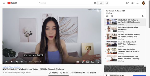
To do this praxis assignment, I chose to analyze some aspects of Chloe Ting’s Youtube Channel by using Voyant, an open-source text analysis software.
For those who may not know her work or are not so fond of YouTube at-home workouts, Chole Ting is a very famous YouTuber and fitness influencer that became viral in 2020, as many of us had to stay home during this year due to COVID-19 pandemic. Before the pandemic had spread globally, Ting had 2.6 million subscribers on YouTube, and by the end of July, she was nearing 13 million. While I write this post, her channel shows the mark of 22,3 million subscribers.
There are a couple of reasons why she became such a hit. She has easy-to-follow exercises and short videos, and for most of them, you don’t need any equipment. At the same time, her plans are specific, meaning if you’re looking to train your abs, legs, bum, or shoulders, there is a video or two for you.
What are the most frequent types of training people look for in Chloe Ting’s 2021 workout videos?
My hypothesis was that I could get the answer by identifying the most frequent words in Chloe Ting’s 2021 workout video titles in two phases: first, by doing this exercise with all video titles, in order to understand the general pattern; second, by doing it only with the titles of the most viewed videos (with more than 10M views), in order to consider if there are significant differences between them. For that, I decided to use Voyant, a web-based software that provides different sorts of graphs based on text analysis.
Since I was interested in finding differences between word patterns, I selected the Cirrus visualization, which is a word cloud that visualizes the top frequency words of a corpus or document. Above, you can find the result I got by trying to answer my question:
Most frequent words in Chloe Ting’s 2021 workout video titlesMost frequent words in Chloe Ting’s 2021 most seen workout video titles
Analysis
While some of the most frequent words remained the same (such as workout, challenge, and min), words related to abdomen workout (such as abs, stomach, and flat) were more frequent in the titles of the most seen videos, as well as words related to aerobic workout (such as loss and weight).
Based on these results, we could infer that Chloe’s audience is more focused on losing weight and getting shredded abs. However, as I decided to also analyze in what ways the most viewed videos were presented in Chloe’s channel, I discovered that other aspects of analysis should be considered.
For example, I noticed that the most seen video in Chloe Ting’s 2021 workout training is a 8 minute quick warm-up routine video, with more than 18M views. Despite its success, as it is the only workout video she produced in 2021 with this specific focus, the expression “warm-up” doesn’t even appear in the cirrus visualization of the titles of the most seen videos.
As I started my exercise to understand issues regarding human behavior on Youtube, analyzing word frequency on video titles provided me with superficial and biased results. First, while exploring the text mining technique, I realized that I should have considered the number of videos that are offered in Chloe’s channel related to each theme. At the end of the experiment, however, I also concluded that answering my question depended on understanding how Youtube’s audience consumes content and how their behavior shapes how Youtube’s algorithm suggests content.
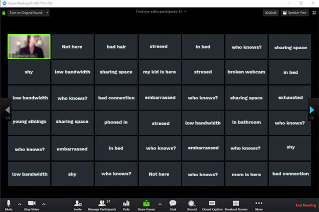
A couple of weeks ago, I attended a workshop developed by the Teaching and Learning Center called Listening in the Classroom: How to Foster Student Agency. My interest in participating in this experience has a lot to do with my work. As a strategic designer who often works interviewing people and facilitating group work, I need to practice my listening skills and create opportunities for others to do it too. From my perspective, listening is problematic because, unfortunately, most of us didn’t learn it intentionally in school. Even though traditional education has much to do with teachers dominating speech while students stay listening, the listening skill presented in the workshop was different: it was active listening to develop empathy, dialogue, and critical thinking.
To start the workshop, the facilitator proposed that we discuss in small groups what the biggest challenges that we faced in the classroom were. After discussing this topic and registering it on a Padlet board, we shared our impressions with the whole class. It was a well-suited warm-up since we realized that many of our challenges are the result of a lack of listening. As a result, we became more open and engaged in learning about the relevance of the subject.
The facilitator then presented listening as fundamental in communicative processes. It was argued that we are not taught to listen, differently from other important communication skills such as public speaking, writing, reading etc. He also explained that listening is crucial because it opens a space to learn and an opportunity to open ourselves to other points of view. In other words, it allows us to see others’ positionality.
Pedagogy of Listening was then presented as a theoretical framework based on the work developed in schools in the Italian region of Reggio Emilia, after World War II. Its pedagogical approach was revolutionary as it proposed recognizing children as agents in the learning process, emphasizing the importance of adults listening to children.
Pedagogy of Listening has three essential aspects:
Emergent curriculum: projects are designed once interest “emerges” in children. Listening allows teachers to identify those areas and respond to them.
The Hundred Languages: there are multiple ways to express learning.
The Image of the Teacher: teachers must act as teaching researchers and researchers of themselves.
After this introduction, the workshop facilitator proposed another thing: a free writing exercise in which we should register how these aspects could be put in practice in our teaching. After that, the facilitator presented another essential reference: the Critical Pedagogy developed by the famous pedagogue Paulo Freire. For Freire, passive listening happens with the banking method of education (traditional education). Active listening occurs when teachers and students work as co-investigators, as partners, in a dialogical relationship. “Listening attitude” is also aided by a group of virtues: love, humility, faith, trust, and hope.
After that, we were asked to put in practice our learnings in an exciting way. Based on our personal ideas of how we should use Pedagogy of Listening and Critical Pedagogy, we were asked to share our visions in small groups and listen attentively to the ideas of our peers. By the end, we had to share each other’s visions to the whole group. Some of us found it easy; others couldn’t do it.
To summarize, it was an excellent opportunity for me to think more critically about listening as a pedagogical practice and learn some activities that I can propose to my colleagues at work.
For anyone interested in learning about Listening as a pedagogical approach, I suggest reading Listening to Teach: Beyond Didactic Pedagogy. It is available online in Mina Rees Library.
Thinking about innovation has had, for a long time, a strong association with the picture of privileged places like Silicon Valley, where an intellectual white and male elite retains the privilege of creating the new trendy gadgets of the future. Although this concept is still strong in our collective imagination, it carries a huge blind spot. It hinders our capacity to see real solutions emerging from simple people in their struggle to make technologies they have in hand suitable for our needs. In this post, I will expose this blindness by presenting a force that makes real innovation happen: the culture of repair.
Jackson (2014) defines that, in scientific computation thinking, repair is something that comes after innovation. In his words:
“innovation is reserved for new and computationally intensive “bright and shiny tools,” while repair tends to disappear altogether, or at best is relegated to the mostly neglected story of people (researchers, information managers, beleaguered field technicians) working to fit such artifacts to the sticky realities of field-level practices and needs. In both cases, dominant productivist imaginings of technology locate innovation, with its unassailable standing, cultural cachet, and valorized economic value, at the top of some change or process, while repair lies somewhere else: lower, later, or after innovation in process and worth.”
Given this distinction, I ask myself who can afford innovation. If innovation is to solve problems effectively and in scale, why can’t repair be considered a genuinely innovative force as it is the way that most people in our unequal world find to transform things that are already in hand as tools in their daily lives?
Jackson exposes repair as “subtle acts of care”, where “human value is preserved and extended, and the complicated work of fitting to the varied circumstances of organizations, systems, and lives is accomplished”. Using the term “care”, which is profoundly human and feminine in many aspects, makes me think about how it pushes the “human-centered design” concept, usually associated with real innovation, to another level. Repair, especially for those in economic and social fragility, may be translated as innovating to survive.
Ernesto Oroza, a Cuban designer and architect, makes this clear in his ethnographic research about Cuba’s DIY culture. To support the idea that receiving large grants and infrastructure to Digital Humanities projects hinders scholars from acquiring an intimate knowledge of digital technologies and, therefore, develop their own digital humanities knowledge, Oroza presents his concept of Moral Modulator:
“As opposed to Le Corbusier’s modulor, a physical scale based on human proportions to bridge discrepancies in measurement, the Moral Modulor provides us with a moral scale to bridge divergent measures. The proportion is the need, and its basic units are survival and love”.
In another moment, he illustrates that the Moral Modular is an individual who has the impulse to rebuild human life. He does it for his children or his family. His days are busy with searching for food, water, resources, or finding a roof.
To summarize, although innovation is firmly attached to privileged places and people, supported by the dual concept of designs and users, repair should be considered genuine human-centered innovation, as it is a practice of care and survival. By trying to understand better the way the culture of repair takes place in different societies, and how solutions are incorporated into people’s lives (especially the ones with low income in undeveloped countries), traditional innovative centers would diminish its blindness about how new products are really used, as they are often resused and transformed.
References
Jackson, Steven J. 2014. “Rethinking Repair.” In Media Technologies: Essays on Communication, Materiality, and Society, edited by Tarleton Gillespie, Pablo J. Boczkowski, and Kirsten A. Foot, 221–40. The MIT Press.
Gil, Alex. 2016. “Interview with Ernesto Oroza.” In Debates in the Digital Humanities 2016, edited by Matthew K. Gold and Lauren F. Klein. University of Minnesota Press.
If you don’t know how to code, don’t have time to do it, or cannot afford a paid solution for creating maps, ArcGIS Story Maps is a good option for you. This tool is a story-authoring web-based application that enables you to share your maps in the context of narrative text and other multimedia content, all in a very user-friendly interface.
To discover its potential, I tested this solution to create a very simple prototype of a project that I started to develop this semester: a website that presents stories about the experience of learning English during the pandemic, specifically through the lenses of F1 VISA students in NYC. I’ll share here my discoveries by showing which maps I wanted to create initially on my website x what the software allowed me to do.
1_ Maps I envisioned to create in my prototype
In my website prototype, which I gave the temporary name “Broken English,” I envisioned creating 3 kinds of maps/visualizations:
Map 1: Where do these students study and live?
A map with the city of New York with pins over all English schools. The user should be able to click on any pin and check photos and videos about each school, testimonies of teachers, and charts with numbers such as how many students hold an F1 Student Visa and which country/region they came from. I’d also like to provide in this same map where these students live and their nationalities by using different colors to identify in which schools there are more international students. Since there is a lot of different information to see on the same map, maybe I could implement filters.
Map 2: Where did they come from? What are their identities?
The second map could be a map of the entire globe, in which it is possible to click on a specific country and check how many people have been going to the USA in the past 20 years, presenting the percentage of how many came here to study, to work or simply as tourists. I’d also like to link it to testimonies of students talking about their countries and comparing their culture with American culture, specifically with their vision of NYC culture.
Map 3: What are their stories while taking classes during the Pandemic?
The last map I would like to show is a group of images, videos, and audio recordings of students and teachers sharing their stories about taking classes during the Pandemic. As I think this specific topic may be a little sensitive for them to be willing to reveal their identities, I would like it to be simply a group of clickable images. It would be nice if the interface could allow the user to search for the content according to different categories, such as nationality, kind of media (photo, audio, video, text etc.), student or teacher, etc.
2_ What I couldn’t do in an ArcGIS Storymaps free account
Before sharing my experience trying to make these three maps, it’s essential to understand that there are differences between the free account and the subscription account:
Features available in the free version: Text, Button, Separation of blocks, Maps, Images, Video, Map, Swipe, Slide Show, Sidecar and Maptour;
Exclusive features to the subscription account: Image Gallery, Audio, Embed, and Timeline.
With that said, I found limitations in some cases, not because the technology didn’t provide some specific features, but because I had a basic free account. However, my overall experience was quite good, as I could effortlessly start my interactive story by adding blocks of content in different formats.
Pop-up with the different kinds of interactive objects one can use
Limitations to creating Map 1
It was OK to create the maps that I needed to develop as they were, in general, simple maps of the world and of New York City. However, using different filters to provide various sorts of data using the same map wasn’t possible. When I tried to create Map 1, for example, to provide the different visualizations I intended to use, itt became necessary to split the Map into two: one related to English schools only (Map 1.1) and another one related to the numbers of international English students in different boroughs and neighborhoods of NYC (Map 1.2)
When I tried to create the first one, I selected the Map feature. However, I found some limitations to embedding videos to present each school (I then realized that It would be better to use the Docked Panel feature instead).
Map 1.1: English Schools in NYC
Even though StoryMaps provides a library with different maps for the users to embed all sorts of maps, as I was creating the second map, I couldn’t find one that would show the limits of each borough and neighborhood of NYC. If I really can’t see one map with those limits, I’ll probably have to draw all of them on my own. I did that for one neighborhood, as you can see below:
Map 1.2: Where international English students live
I confess that I’m not so worried about this because it is probably difficult to access this sort of data.
I also got confused with the save button of each change I’d have to do in the maps. You first have to click DONE to save changes in each pin on the map and then click on DONE again. I clicked only on the second DONE many times without clicking the first one and therefore kept losing my editions over and over. Maybe it would be better to have only one DONE button.
Limitations to creating Map 2
Creating Map 2 was easy, but it is better to use the Docked Panel feature instead of the Map feature to provide videos connected to the different places. I ended up using the Map feature again and therefore found some limitations to making it more interactive.
Even if I used a Docked Panel to present this map, I wouldn’t associate audio recordings with each testimony, only videos. Maybe it is possible to do this on the subscription version, but it isn’t with a free account, as you can see below:
Map 2: Where do international English Students come from? What are their stories?
Limitations to create Map 3 When I tried to create Map 3, I discovered that creating a grid visualization that could mix different sorts of media is impossible. It is, however, possible to create an interactive map, as you can see below:
Map 3: stories of taking English Classes during the Pandemic
And at last: is it possible to create a crowdsourced website?
As I started to develop this prototype, I started thinking how interesting it would be if Map 2 could be continuously updated by students as a crowdsourcing visualization. I found that it is possible to do this if I create a map using the ArcGIS platform and then publish it as public and collaborative, as you can see here: https://learn.arcgis.com/en/projects/share-a-map/
I then would embed it from this part here (Living Atlas):
Living Atlas feature
3_ Conclusion: should I use StoryMaps in my project?
Although it has some limitations, I think it is quite satisfactory for what I intend to provide on my website. I also believe that it may have even more possibilities if I spend even more time exploring it.
Here I share the link to my rough prototype: https://storymaps.arcgis.com/stories/5955dad071da489ebef86f42d3924144
Comments about Peabody’s historical visualization work and its connections to the evolution of InfoVis in the digital era
How could we reimagine our futures based on seeing important events of our past from different perspectives? That was what Elizabeth Palmer Peabody, the nineteenth-century writer, editor, and educator, proposed in her historical visualization work. Peabody developed a method that consisted in translating historical events into shape and color. Developed as a pedagogical practice with her students, she intended to help them register their account of the past converting text into image. By exploring different forms of understanding about the past, they would have new ways to develop a critical view about what could be their desirable futures.
One example of Peabody’s historical visualization work of important facts that occurred in the world in the 1600’s.
Why does this chart impress me? In my perspective, it has a great connection with current discussions about the evolution of InfoVis (Information Visualization) and how it has opened up new forms of interpreting information through graphics.
According to Lev Manovich (2010), InfoVis is a practice that traditionally carries on two key principles: reduction, since it uses graphical primitives such simple geometric shapes to stand in for objects and relations between them; and the use of spatial variables (position, size, shape, etc.) to represent critical differences in the data and reveal most essential patterns and relations, instead of valuing other visual dimensions such as tones, shading patterns, colors or other graphical elements.
With digital technologies, he points to the emergence of media visualization: a new era for InfoVis based on the possibility of creating visualization without reduction. By using data objects, we can now create visualizations directly from them, not using graphical shapes to explain something visually. Consequently, the viewer is pushed to develop different forms of interpreting data through infographics. Instead of capturing information by analyzing simple graphics, media visualization turns into an aesthetic experience, as well as a prolific way to have new forms of inquiry. One example of this is the project Cinema Redux, which involved sampling a film at the rate of one frame per second and scaled each frame to 8×6 pixels.
Image of Cinema Redux project
Even though Peabody’s historical visualization work consisted in reducing information and using graphical primitives (as a typical InfoVis project), by using colors and textures as important variables to convey meaning, it pushed viewers to interpret information by identifying patterns, going beyond the linear way of naming important facts from the past as we would see in a timeline. In Peabody’s classes, that was a writing and reading exercise for her students to unlock their imagination about the future.
What kind of futures will we be able to imagine by exploring the new possibilities that the digital era opens for InfoVis? From my perspective, the answer depends on our openness and effort in developing reading skills that enable us to do it.
“A superior man, in regard to what he does not know, shows a cautious reserve. If names are not correct, language is not in accordance with the truth of things. If language is not in accordance with the truth of things, affairs cannot be carried on to success. When affairs cannot be carried on to success, properties and music do not flourish. When properties and music do not flourish, punishments will not be properly awarded. When punishments are not properly awarded, the people do not know how to move hand or foot. Therefore a superior man considers it necessary that the names he uses may be spoken appropriately, and also that what he speaks may be carried out appropriately. What the superior man requires is just that in his words there may be nothing incorrect.”
Confucius, The Analects -13
In this quote, Confucius presents a deep relation between work’s success and sharing a consistent understanding of language. This thinking is beneficial, especially when we need to define transdisciplinary areas of knowledge.
As a service designer who works in a strategic design studio and a scholar aiming to pursue an academic career, I constantly face the challenge of defining “design.” It is a challenge because Design is a field yet to mature, both in terms of being known and self-knowledge (PORTUGAL DO NASCIMENTO, 2020). Design is anything and everything, sharing its identity with other disciplines such as fine arts, architecture, engineering, information technology, marketing, advertising, handicrafts, the culinary arts, hair styling, and so on.
The same thing happens with Digital Humanities, as its studies and practices are also fuzzy, blurry, complicated to delimit. Gold (2012) presents this field as a place of discussion between those who relate Digital Humanities to an area that explores new digital tools to aid relatively traditional scholarly projects and those who believe that it is a disruptive political force, with the potential to reshape fundamental aspects of academic practice. In my understanding, these definitions are incomplete, since both approaches are connected and interdependent.
I like the definition of Digital Humanities as a “trading zone” or “meeting place,” as it is proposed by Galison (apud GOLD, 2012). In using digital technologies to produce new epistemological possibilities in areas such as History, English, Art, Computer Science, Philosophy, etc., digital humanists have the power to engage in projects that evoke ethical, social, and political issues, transforming academic discussions into more collaborative and exciting conversations with the general public. In addition, I think that, as Stephen Ramsay points out, Digital Humanities is about building (or even more precisely, coding) things, enabling multimodal ways to access knowledge.
A project that exemplifies this definition is Gulu Sound Tracks, presented in the August 2021 edition of Reviews in Digital Humanities. Developed for both academic and non-academic audiences, it offers a collection of eight high-tempo audio tracks that remix Gulu’s familiar sound worlds to tell of the city anew. As an intersection of experimental ethnography, creative arts, digital humanities, and sound studies, it takes sound production as a mode of critical public scholarship that privileges openness, de-centering text-based knowledge forms to amplify the work and ideas of those that do ethnography. As a result, anyone with access to the internet can dive into Gulu’s environments and enjoy delightful music.
As a designer, I know the importance of discussions that aim to clarify collective understanding around practices, especially in broad and blurry fields of knowledge such as Digital Humanities. Therefore, as Confucius presents it, let’s be cautious and keep using language according to the truth of things. This way, we will work properly and see the results of efforts as digital humanists flourish.
References
CONFUCIUS, Analects, Book XIII, Chapter 3, verses 4-7, translated by James Legge.
GOLD, Matthew K. 2012. The Digital Humanities Moment In Debates in the Digital Humanities, edited by Matthew K. Gold. University of Minnesota Press.
PORTUGAL DO NASCIMENTO, Luís Cláudio. 2020. Diseño en medio de feudos y campos: la oportunidad de la “rectificación de nombres” propuesta por Confucio en la Babel contemporánea de conceptos, términos y expresiones pegadizas recientemente forjados en el campo del diseño. In Cuadernos del Centro de Estudios en Diseño y Comunicación [Ensayos] Nº 80, Buenos Aires.
Need help with the Commons?
Email us at [email protected] so we can respond to your questions and requests. Please email from your CUNY email address if possible. Or visit our help site for more information: